
Sunday, 28 February 2016
Saturday, 27 February 2016
Final Piece
This is my completed final piece. My ideas changed a lot during the ten hours that I had to make it, but I am really happy with the way that it turned out and feel as though it really fits my brief.


Final Piece (Process)


When I started, I used a cool colour scheme when colouring the woman in the middle. This fit the blue galaxy photograph that I used as the background. However, when I added the bright colours around the woman, I felt that it did not merge well with the subtle and dark background. I decided to make my own background that was bolder and brighter and fit with my theme more.


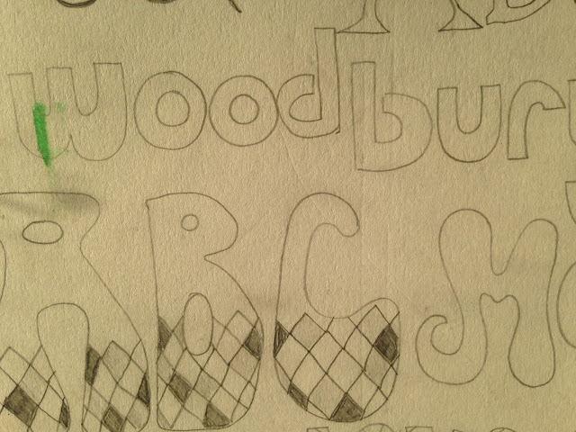
This is the type that I used for the main title. It is eye-catching, bold and fits around the image well. I first drew out the text to ensure that it fitted well around the diamond. I then scanned it it and coloured it in in Adobe Photoshop.

This is the text that I used for the details. It is smaller than the main title, but still fits around the image, which is the main element. I was originally going to include the name of the headliners, however I decided not to do this in the end as I did not want the layout to look too clustered. I, again, drew this out on paper first before scanning it in and adding it into my poster at the end.


After changing the background, I completely changed the colour scheme of the woman in the middle. I made it more warm in order to reflect the summer element of the festival. I also added more elements to the face such as a septum piercing and festival face makeup. This adds interest to the illustration and reflects the festival style. I did all the colouring on Adobe Photoshop as it makes the colours look more bold and compelling.


At the bottom of the poster, I added symbols in. This gave it even more of a festival vibe and added interest to the row of squares at the bottom. I drew these out and scanned them in, taking my inspiration from the internet.

To make the background look like a galaxy, I simply used ink on a wet piece of paper. I put the ink on a brush and flicked it on the paper. The flicks of different coloured ink were made to look like the stars. When I scanned the inked piece in photoshop, I inverted the colours to make the background black and the colours stand out more.
Friday, 26 February 2016
Emulation
After doing my copy, I emulated the style in a simple draft of my own. The way that I made the emulation reflected the way that I did my copy.


I layered three of the same line together to give it a psychedelic and 3D look.


This is the final outcome. It looks similar to the copy that I did,
however I have edited and changed aspects where I felt necessary.
Thursday, 25 February 2016
Type Choices (Digital)
These are type choices that I have found on Dafont. I chose the ones that I believed to be appropriate, annotating them and then choosing my favourite.


Wednesday, 24 February 2016
Type Choices (Hand Drawn)
These are my hand drawn type choices. I did two full pages and then put three of my favourite on a rough sketch of the layout of my poster to see what it would look like. I annotated these, choosing my favourite one.


These are my two pages that I drew full of different fonts. I mainly took
my inspiration from Dafont and my similar artefacts pin board on Pinterest.


These are the three fonts that I chose to put into my layout. I decided to go with something
similar to the second one on my final piece as I feel it is the most interesting and eye catching.
Tuesday, 23 February 2016
Monday, 22 February 2016
Final Draft
When doing my final draft, I just took my preferred poster from my four different colour schemes, and enlarged it. I added more detail to it then I did with the colour choices, but am not completely happy with it so I will probably change it slightly during my exam so that it is completely perfect.


This is my final draft. In the exam, I will use a different media in order to achieve a more
bold look. I will also change the layout slightly in order to make it seem less sparse and
more busy. I will make the glasses more interesting by adding an interesting galaxy image.
Finally I will change the dates as it isn't a weekend, in order to make it more authentic.

Sunday, 21 February 2016
Colour Choices
When doing the design for my music festival poster, I tried out four different colour schemes; cool, warm, triadic and local.

For the cool colour scheme, I used varying tones of blues and for the warm colour scheme, I used varying tones of reds, oranges and browns. When doing the triadic colour scheme, I used mid-green, dark-brown and orange. Finally, for the local colour scheme, I used local colours and a purple background.
I have decided to use the cool colour scheme as I believe it is interesting and makes the poster seem more poetic.

I have decided to use the cool colour scheme as I believe it is interesting and makes the poster seem more poetic.
Saturday, 20 February 2016
Artist Copy
For my artist copy, I copied the technique that a designer used for a "Moving Stones" music poster. I used ink and a paintbrush to achieve the flow of the lines. I coloured in the copy in Adobe Photoshop.


I used an image of my friend for the face at the bottom
as she was my model when doing my contact sheet.

I also copied and pasted the men and the text at the bottom to
make in more accurate.

Above: My finished copy.
Below: The poster that I copied from.

Friday, 19 February 2016
Drafting
I chose my favourite scamp and refined it four times, making it better each time. This helped me to really analyse and think about what I was designing. It further helped me to really condense my design in order for it to fully fit the brief that I have chosen.


Note that the colours may change over the course
of producing this piece, and are only a basic idea.

Thursday, 18 February 2016
Drawings of Subject Matter
I drew two pages of primary sketches from photographs and images that I have taken/ that are from the internet.


On my first page, I drew a range of 1960s appropriate sketches such
as sunglasses and festival hairstyles. This will help me as I can include a
genuine hairstyle that will help to make my poster more authentic.

My second page includes a range of face features, such as noses and eyes. This will help me when drawing out my final piece as I can make the person that I draw look more realistic.

Subscribe to:
Comments (Atom)